Fit and analyze peaks
Problem
Scan a region where a peak is expected. Fit a nonlinear model to the measurements and characterize the peak center, full-width half-max, etc.
Approach
Use the bluesky PeakStats callback. Here’s how it works:
- Like
LiveTableandLivePlot, it receives a live stream of data. - It silently accumulates this data until a run completes.
- It performs a nonlinear best fit, and it makes the results available through attributes that can be used in plots, computations, or future scans.
A convenience function called plot_peak_stats takes a PeakStats
instance as input and produces a nice plot.
Example Solution
Configuration
Create an instance of PeakStats that looks for an x field 'motor'
and a y field 'det'. (These should match the field names of your motor
and detector, whatever they are.)
# These may already be imported by your configuration.
from bluesky.examples import motor, det
from bluesky.plans import scan
from bluesky.callbacks import LiveTable

from bluesky.callbacks.scientific import PeakStats, plot_peak_stats

ps = PeakStats('motor', 'det')
Execution
Run a simple scan (as we did in Perform a simple scan with a data table and plot) but provide the output to our
PeakStats instance, ps, as well as to LiveTable.
In [1]: subs = [LiveTable(['motor', 'det']), ps]
In [2]: RE(scan([det], motor, -10, 10, 15), subs)
+-----------+------------+------------+------------+
| seq_num | time | motor | det |
+-----------+------------+------------+------------+
| 1 | 17:01:30.2 | -10.00 | 0.00 |
| 2 | 17:01:30.2 | -8.57 | 0.00 |
| 3 | 17:01:30.2 | -7.14 | 0.00 |
| 4 | 17:01:30.2 | -5.71 | 0.00 |
| 5 | 17:01:30.2 | -4.29 | 0.00 |
| 6 | 17:01:30.2 | -2.86 | 0.02 |
| 7 | 17:01:30.2 | -1.43 | 0.36 |
| 8 | 17:01:30.2 | 0.00 | 1.00 |
| 9 | 17:01:30.2 | 1.43 | 0.36 |
| 10 | 17:01:30.2 | 2.86 | 0.02 |
| 11 | 17:01:30.2 | 4.29 | 0.00 |
| 12 | 17:01:30.2 | 5.71 | 0.00 |
| 13 | 17:01:30.2 | 7.14 | 0.00 |
| 14 | 17:01:30.2 | 8.57 | 0.00 |
| 15 | 17:01:30.2 | 10.00 | 0.00 |
+-----------+------------+------------+------------+
generator scan ['7c1150'] (scan num: 1)
Out[2]: ['7c115088-450e-406e-86f2-c6ed0595358d']
In [3]: plot_peak_stats(ps)
����������������������������������������������������������������������������������������������������������������������������������������������������������������������������������������������������������������������������������������������������������������������������������������������������������������������������������������������������������������������������������������������������������������������������������������������������������������������������������������������������������������������������������������������������������������������������������������������������������������������������������������������������������������������������������������������������������������������������������������������������������������������������������������������������������������������������������������������������������������������������������������������������������������������������������������������������������������������������������������������������������������������������������������������������������������������������������������������������������������������������������������{'color': 'k'} cen
{'color': 'r'} com
{'color': 'b'} max
{'color': 'm'} min
Out[3]:
{'legend': <matplotlib.legend.Legend at 0x2b2488f01b00>,
'points': <matplotlib.lines.Line2D at 0x2b2488f019b0>,
'vlines': [<matplotlib.lines.Line2D at 0x2b2488f082b0>,
<matplotlib.lines.Line2D at 0x2b2488f08f60>,
<matplotlib.lines.Line2D at 0x2b2488f0f908>,
<matplotlib.lines.Line2D at 0x2b2488f13128>,
<matplotlib.lines.Line2D at 0x2b2488f13c50>,
<matplotlib.lines.Line2D at 0x2b2488f19320>]}
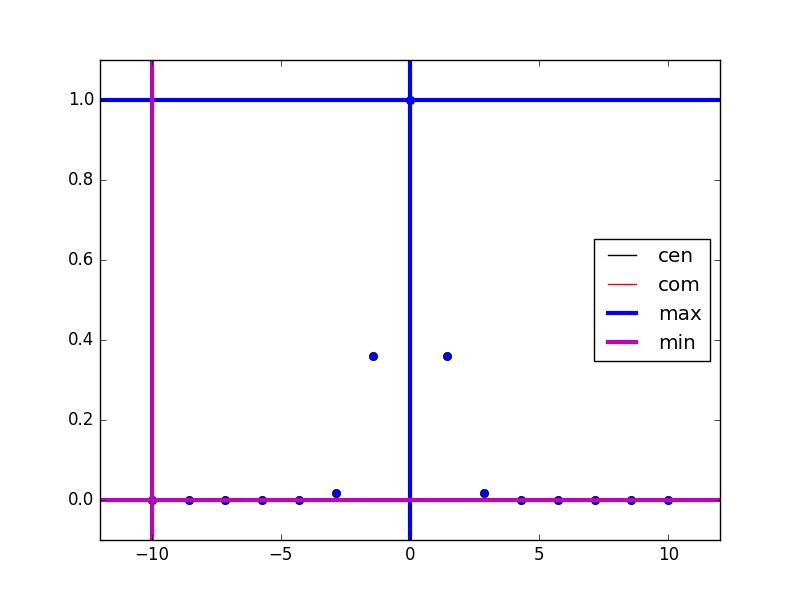
Cross-hairs mark the x and y position of the min and max measurements. (In this simulated data set, ‘cen’ and ‘com’ happen to align perfectly with ‘max’ and are thus eclipsed in this particular example.)